Ending Colour Chaos: a Token-First Design System
Two product surfaces, three primaries fighting for the same buttons, components breaking on BPO-floor monitors. A bottom-up initiative that became a funded design-system program at SquadStack.
the number that matters
Side-of-desk audit → funded org program
- role
- Product Designer II: initiated and led
- focus
- Design systems · Tokens · Accessibility
- status
- adopted
How it started: noticing, not being assigned
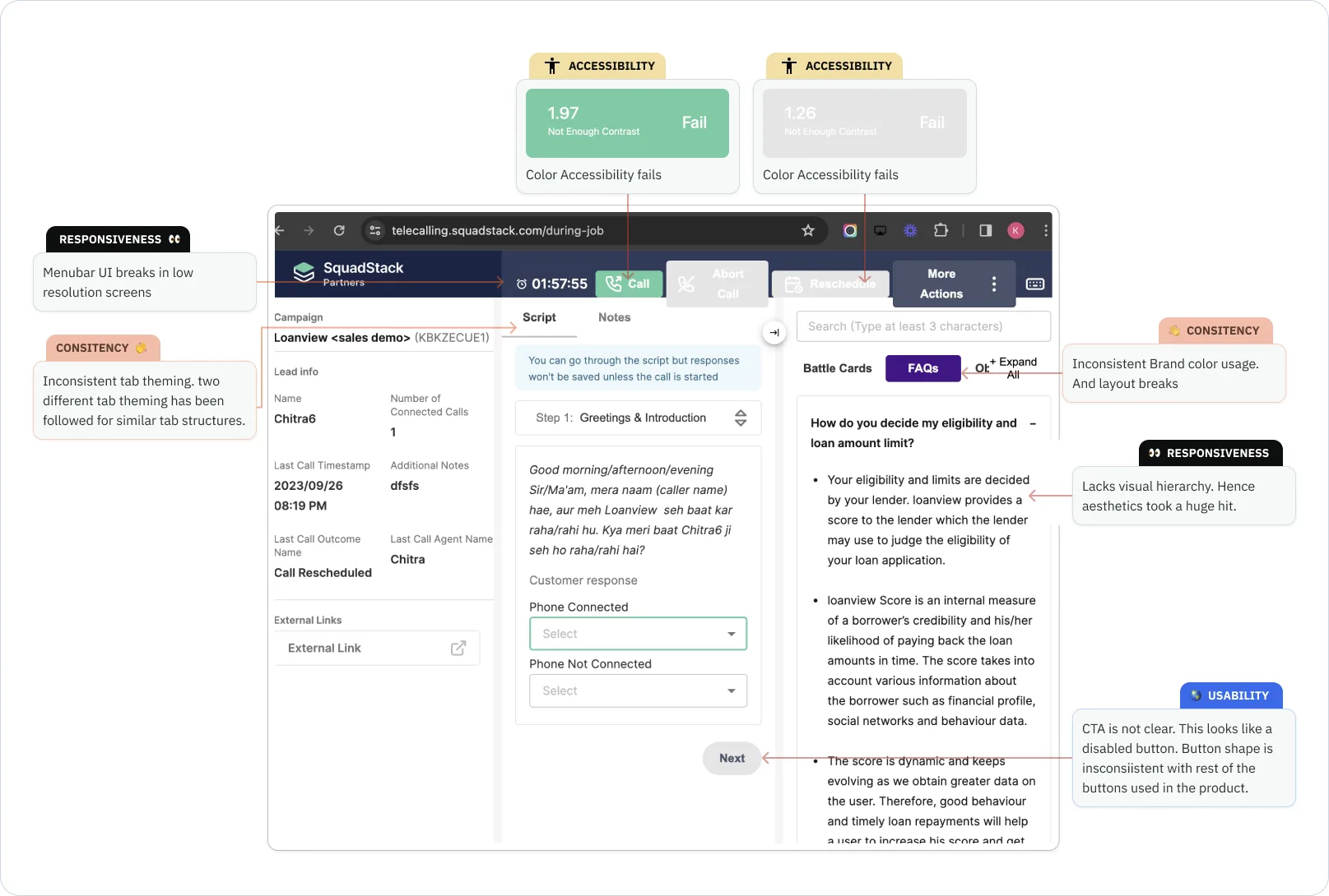
Nobody asked for a design system. As one of two designers in a lean team of seven, I kept tripping over the same things: colours with poor perceived brightness, missing typography styles, text failing contrast checks. I started fixing them in the gaps around daily product work, and kept receipts.
That's the actual arc of this project: a side-of-desk audit that built enough buy-in to become a funded, full-time design-system revamp that I led. The craft below matters, but the initiative arc is the part I'm proudest of.
The two-sided problem
SquadStack's platform has two very different surfaces: a customer dashboard where client businesses track their telecalling campaigns, and an agent app (web + mobile) where telecallers actually run calls. One brand, two audiences, no rules, which produced the signature failure:
- Colour chaos. Three brand colours (lavender, jadeite, oasis) used interchangeably for buttons and key elements on both surfaces. No answer to "which colour goes where?"
- Accessibility debt. Contrast and text-size failures across the product (the target was WCAG 2.1 AA, and the palette itself needed rework to get there).
- Handoff friction. Developers had to guess paddings, colours, and component behaviour per screen; design intent drifted in translation.
- Components that didn't scale with a fast-growing product.
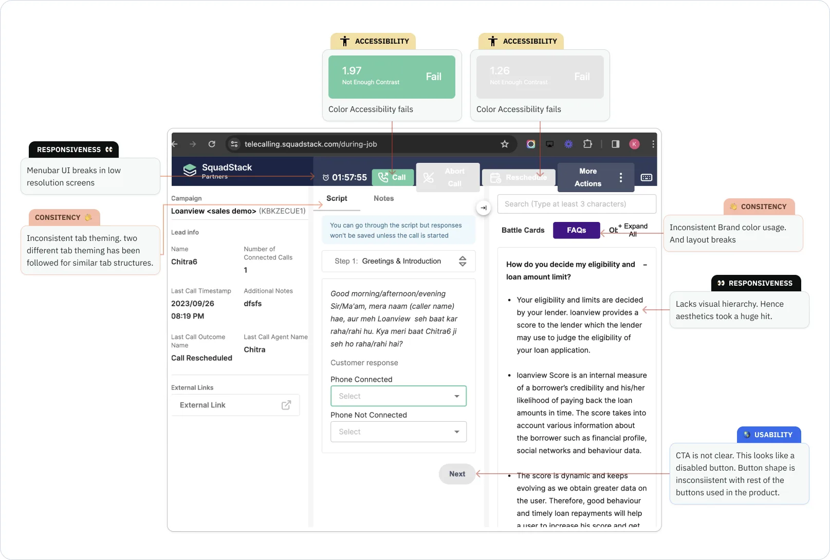
The research finding I still tell people about: I sat with agents on actual BPO floors and found many run old low-resolution, near-square VGA monitors, and our components were literally breaking on them. No amount of Figma polish surfaces that constraint; showing up does. (The same observation sessions seeded several other fixes across the org.)
The system
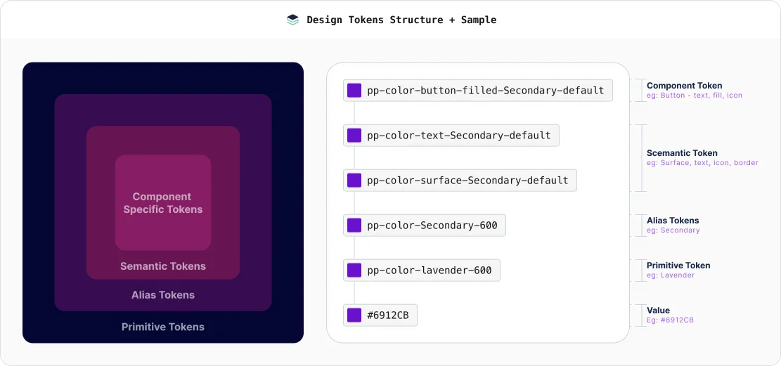
Four-tier tokens as the foundation. Primitive → alias → semantic → component, covering colour, type, spacing, radius, breakpoints, and effects. Every downstream decision, and every future theme, hangs off this structure.
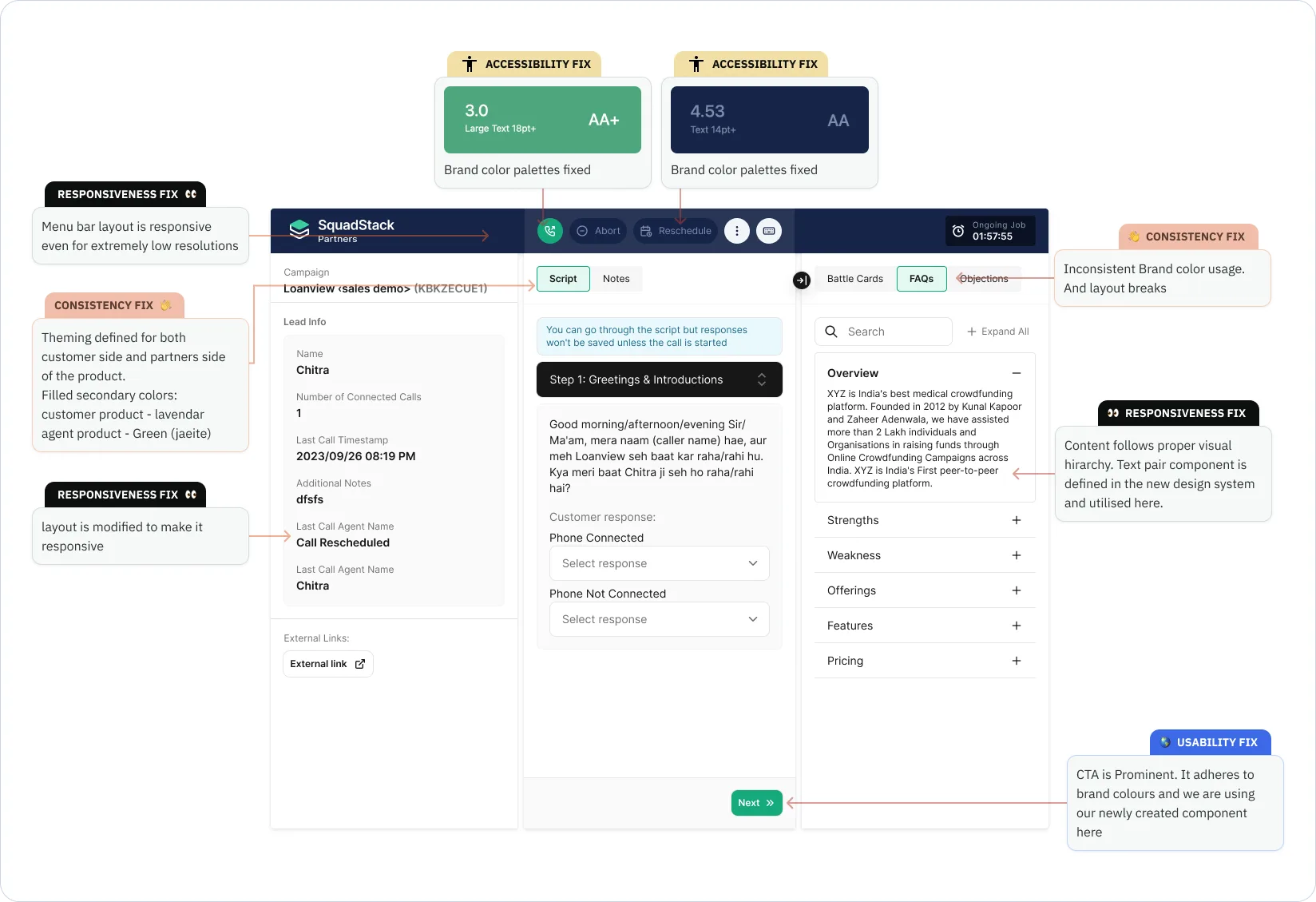
One theming rule that ended the colour war. The decision that did the most work was also the simplest: jadeite is the agent-side primary; lavender is the customer-side primary; oasis is reserved for links and informational text. One sentence, and suddenly every designer and developer had the same mental model of which surface they were on.
Token-first components, audited against reality. I catalogued every existing component and extracted UI element into a component doc, placed next to the live screens in Figma, then rebuilt the library so each new component was tested against every real place it appears before sign-off. Every colour, space, and radius pulled only from tokens; responsiveness and accessibility checked per component.
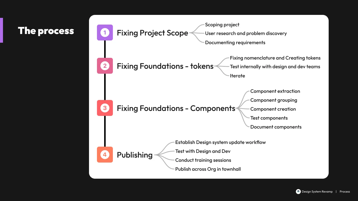
A six-phase operating plan, because a design system is a workflow, not a Figma file: tokens → components → documentation → workflow establishment (design-update governance + developer integration and versioning) → launch & training → maintenance. I mapped the whole thing as a FigJam flow with feedback loops, and I'd argue phase four is the one that decides whether the other five survive contact with reality.
Where it landed, honestly
The system was still rolling out when I moved on, so I won't dress it in invented percentages. The real, defensible outcomes:
- A working four-tier token system adopted as the foundation for both surfaces.
- The surface-theming rule that ended per-screen colour debates outright.
- Major components rebuilt token-first, validated with the designers using them, WCAG 2.1 AA as the bar.
- The org promoted a personal initiative into a funded program. The strongest signal that the work was worth something.
And the payoff arrived sooner than expected: when SquadStack later needed a do-or-die onboarding redesign shipped in three weeks, the token + theming groundwork let me spin up the new theme and component set in days, not weeks. That project's speed is this project's receipt.
What I carry forward
Systems work is trust work. The library only matters if designers and developers believe it will hold. Sitting on the BPO floor taught me more about component constraints than any audit spreadsheet; the one-sentence theming rule did more than the four hundred tokens underneath it. Simple, enforceable rules beat comprehensive, ignorable ones.