Saving the Company in 3 Weeks: Telecaller Onboarding
SquadStack's margins were bleeding through BPO middlemen. A war-mode redesign of telecaller onboarding cut acquisition cost to a quarter, by making the experience good enough to stop paying people to finish it.
the number that matters
CAC ₹10,000 → ₹2,700
- role
- Product Designer II: led research + design end-to-end
- focus
- 0→1 · Onboarding · Behavioural design
The stakes: a business model bleeding margin
SquadStack runs telecalling for large businesses: trained agents, working remotely, managed through a platform. Most of those agents were sourced through BPO partners, and the BPOs took a huge slice of gross margin for it. The alternative, Contract Partners who sign directly through the SquadStack app, kept the margin intact, but the onboarding experience was so confusing that the company was literally paying people to finish it: ₹50 per completed step, ₹500 on completion. About ₹850 in incentives per person, stacked on top of every other acquisition cost.
The company went into a three-week, war-mode push to fix the direct channel. I led the research and the end-to-end redesign of the onboarding flow inside that window.
One principle drove every screen:
Remove friction everywhere. Use friction only where we need to assess real talent.
Onboarding a telecaller isn't a signup form; it's a funnel that has to filter. The assessments had to stay demanding. Everything else had to stop fighting the user.
Research on a war clock
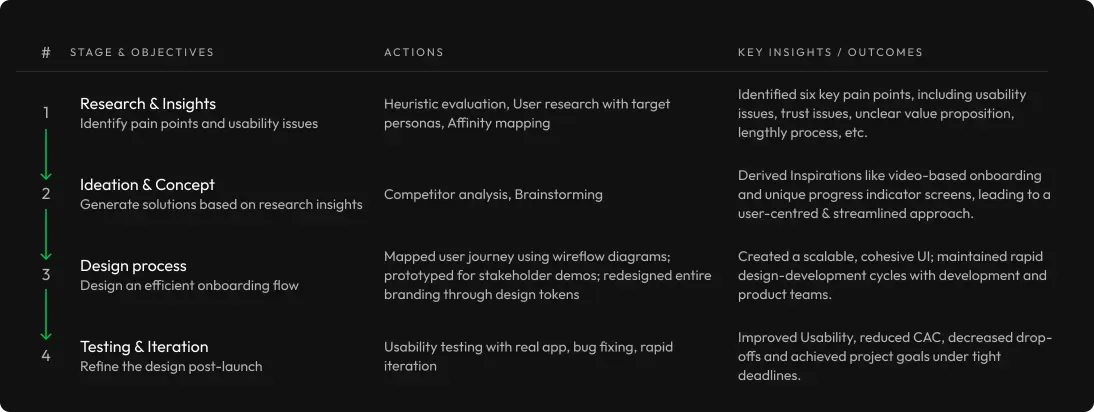
We ran a qualitative study with participants matched to the real persona: Tier-2/3 city job-seekers, BPO agents tired of office setups. When participants no-showed and the study ran long, we didn't stall: the team started working off the first two participants' pain points in parallel while the rest of the sessions completed.
I paired that with a heuristic evaluation of the existing app and a competitive analysis that went deliberately wide of direct rivals (Zomato, Swiggy, Uber, Urban Company) because the real comparison set is every platform that onboards gig workers. Zomato's video-guided onboarding, Swiggy's three-step interface, Urban Company's progress indicator all fed the design; forced permissions, registration fees, and invisible progress went on the avoid list.
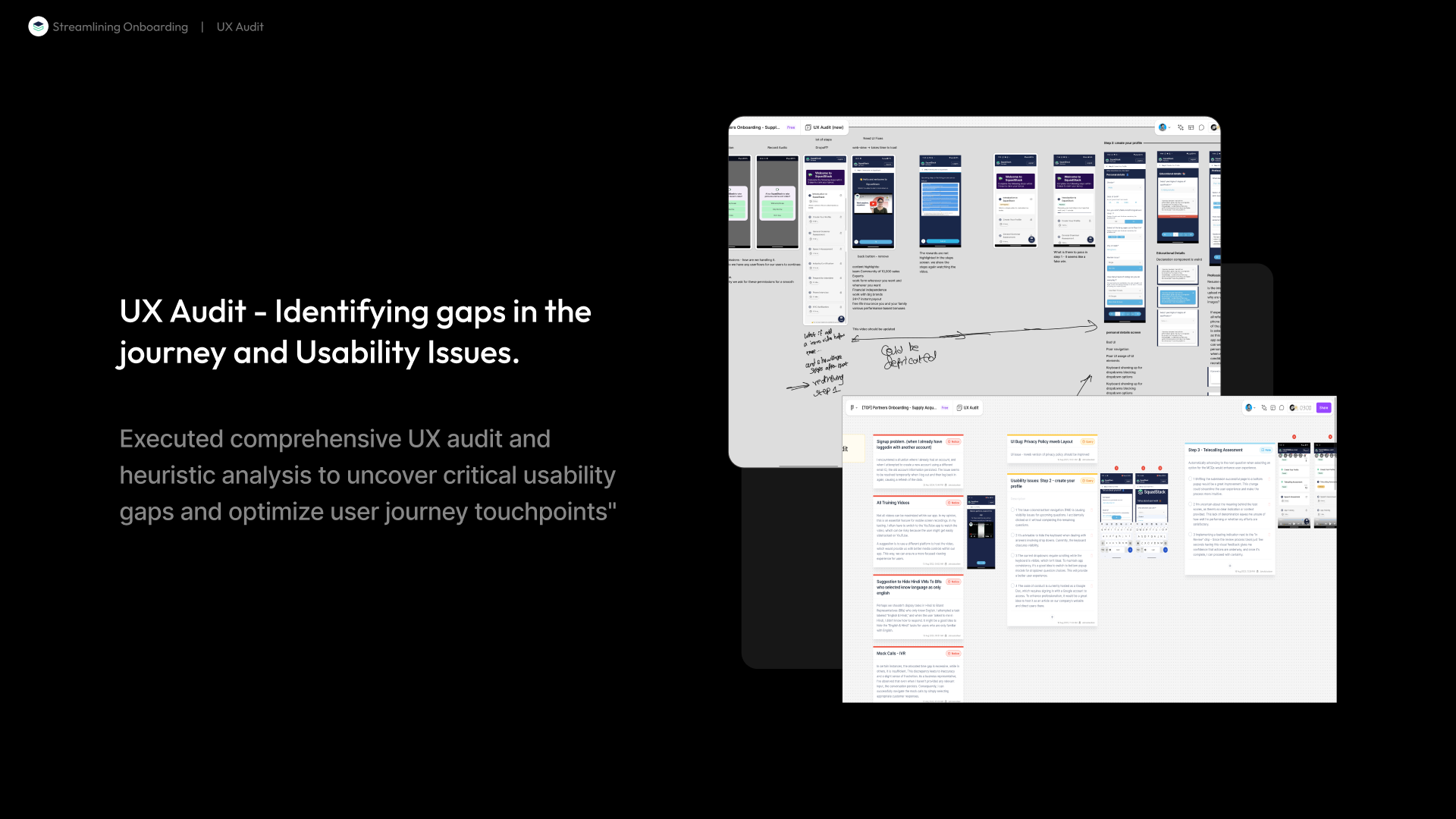
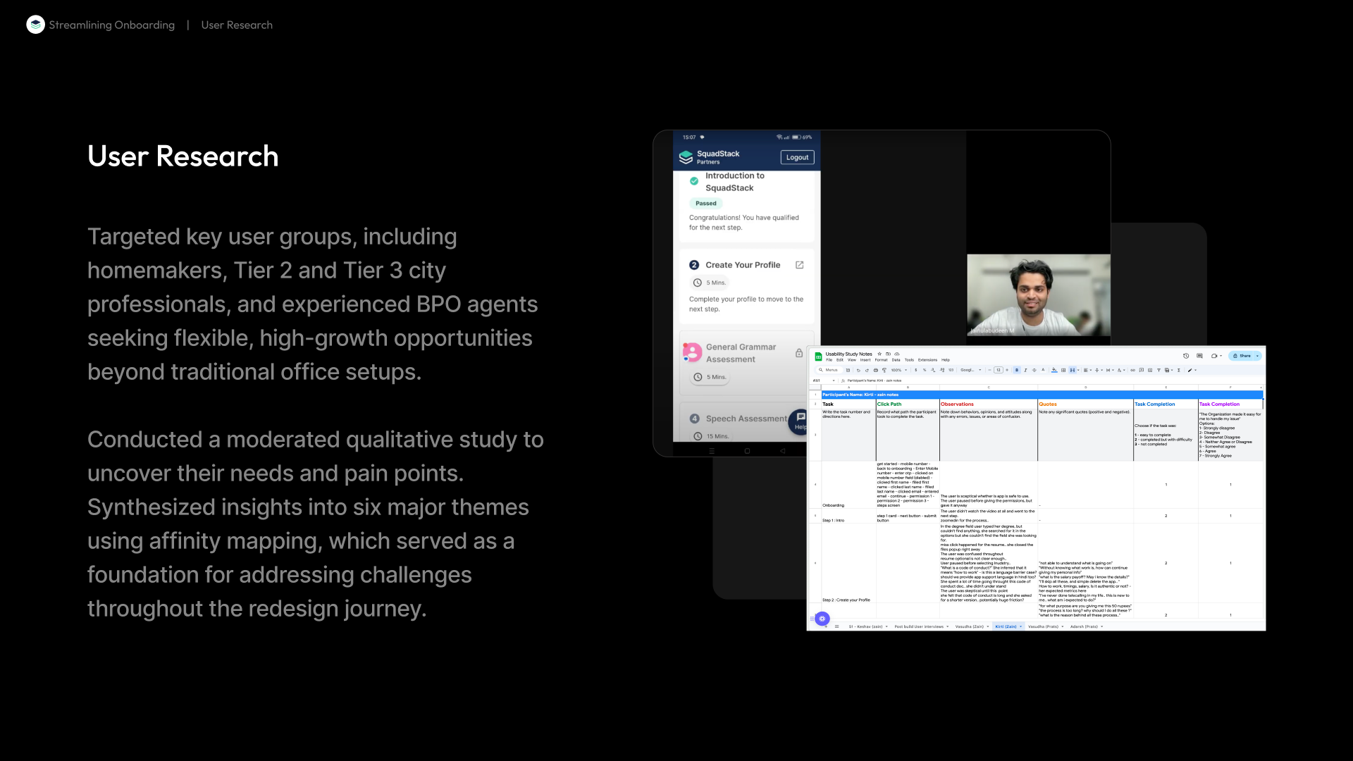
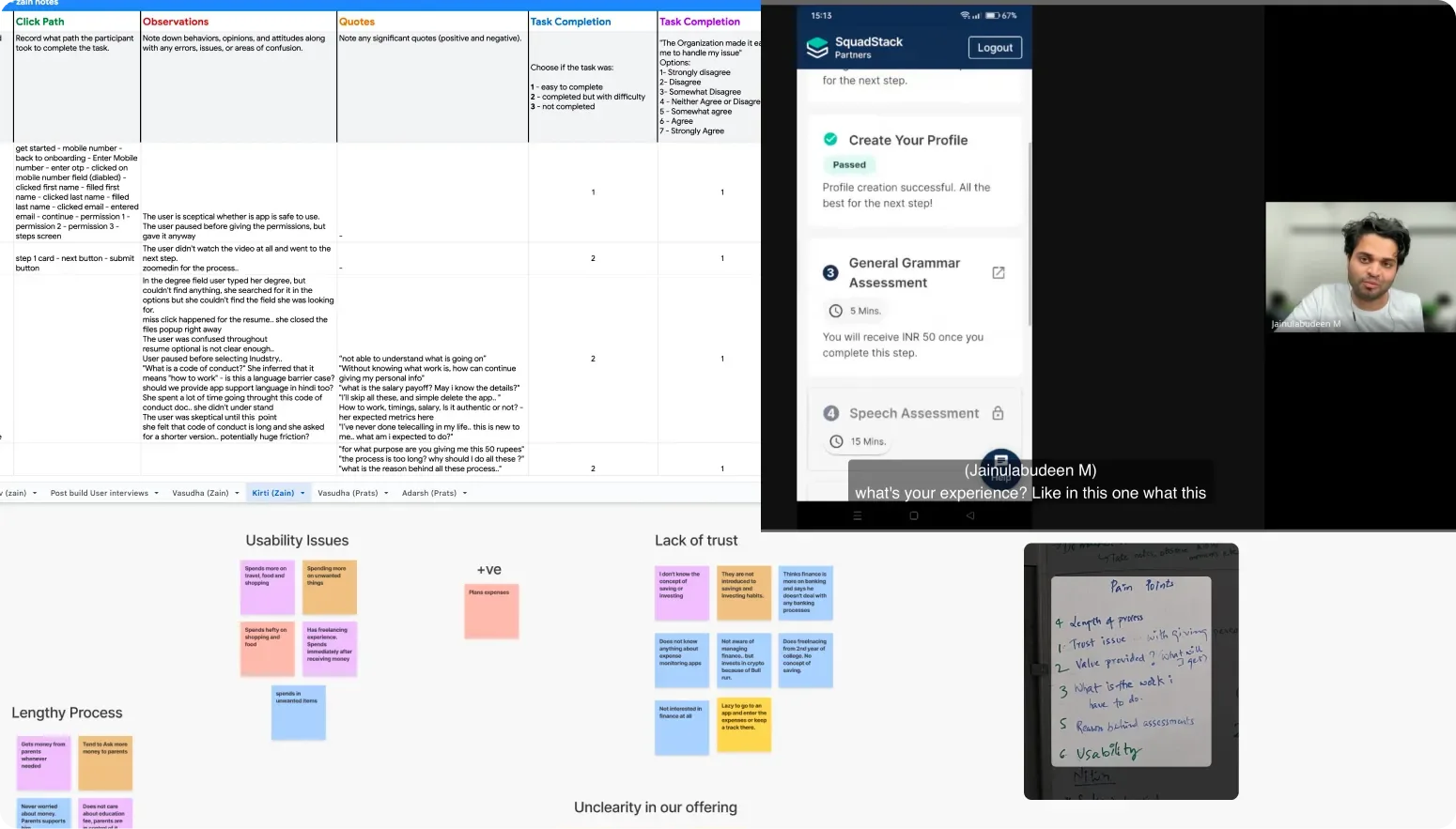
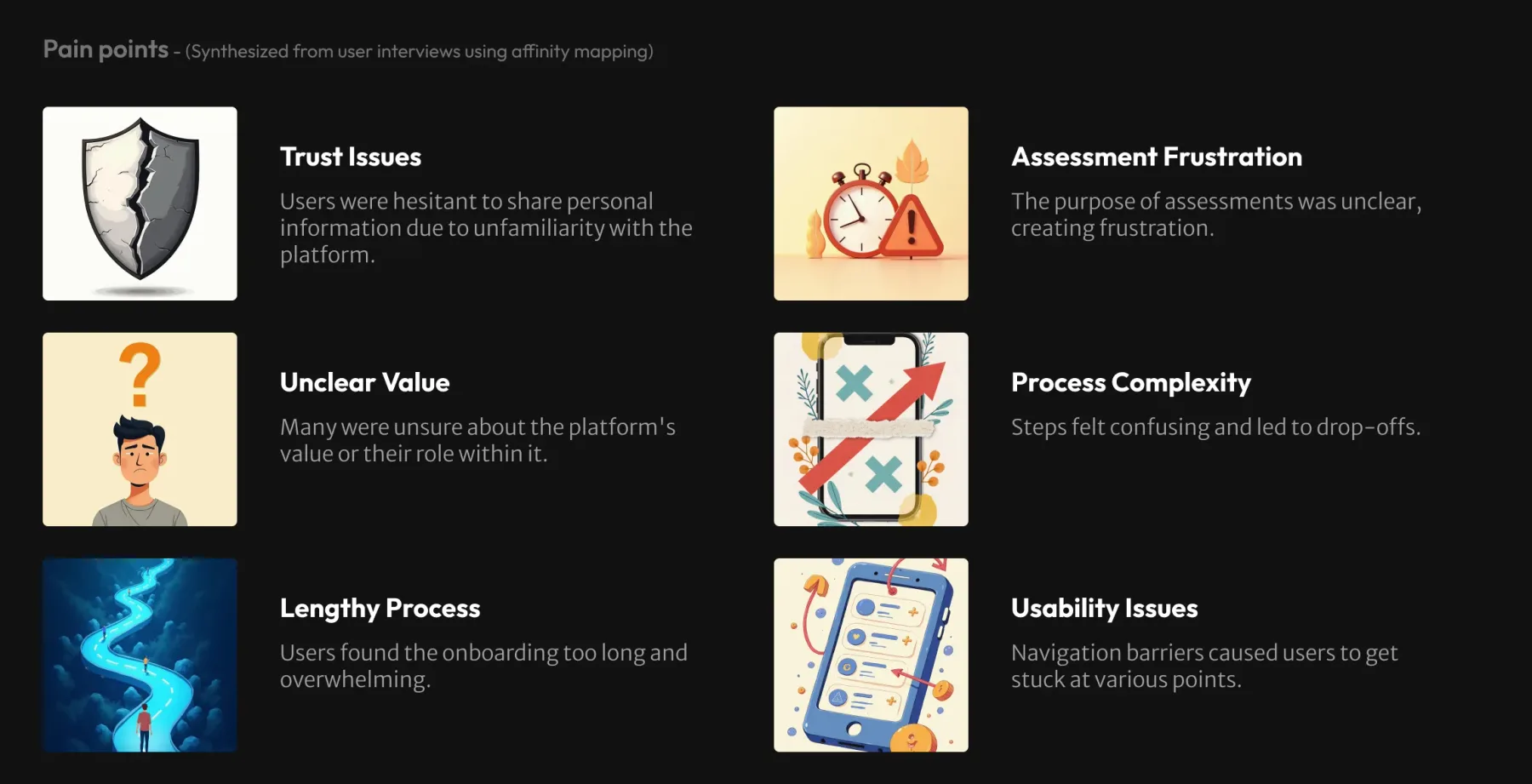
Affinity-mapping the interviews produced six pain-point themes: no trust in the platform · steps too lengthy · value unclear ("what will I get?") · effort per step unclear ("how long will this take?") · usability issues · assessments unexplained ("why am I doing this?").
The design: psychology where the drop-offs were
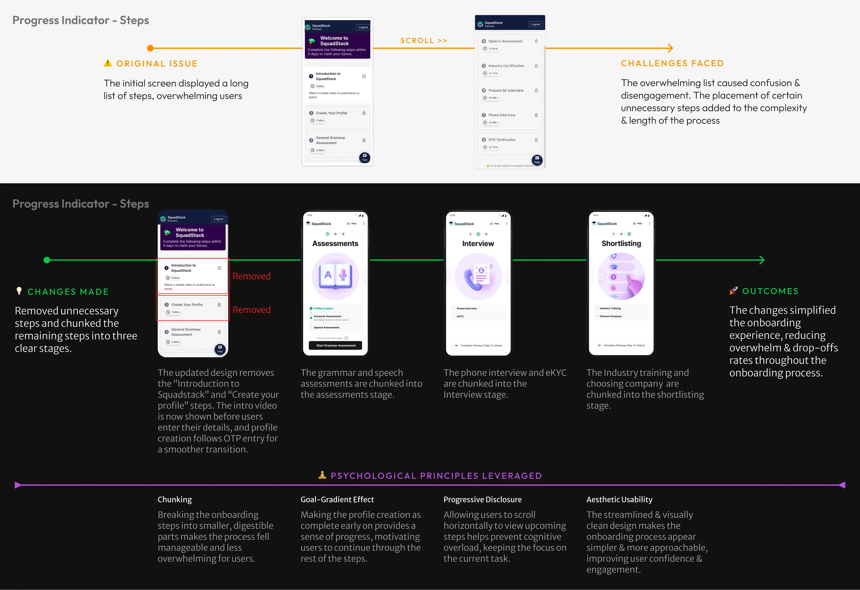
Each fix maps a researched pain point to a named behavioural principle: Zeigarnik effect, endowed progress, goal-gradient, aesthetic-usability, progressive disclosure. Not as decoration: as the reason each change should move a number.
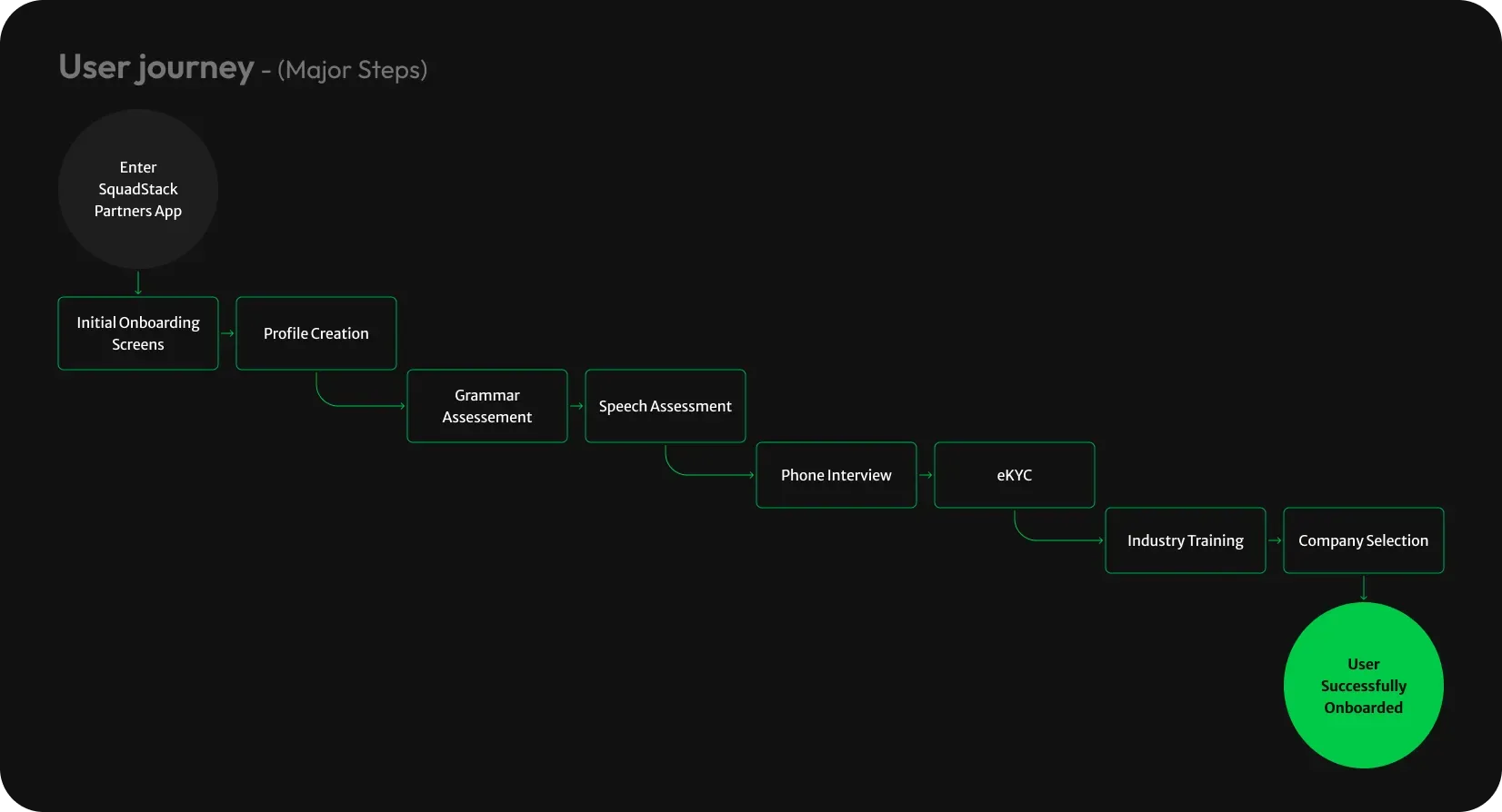
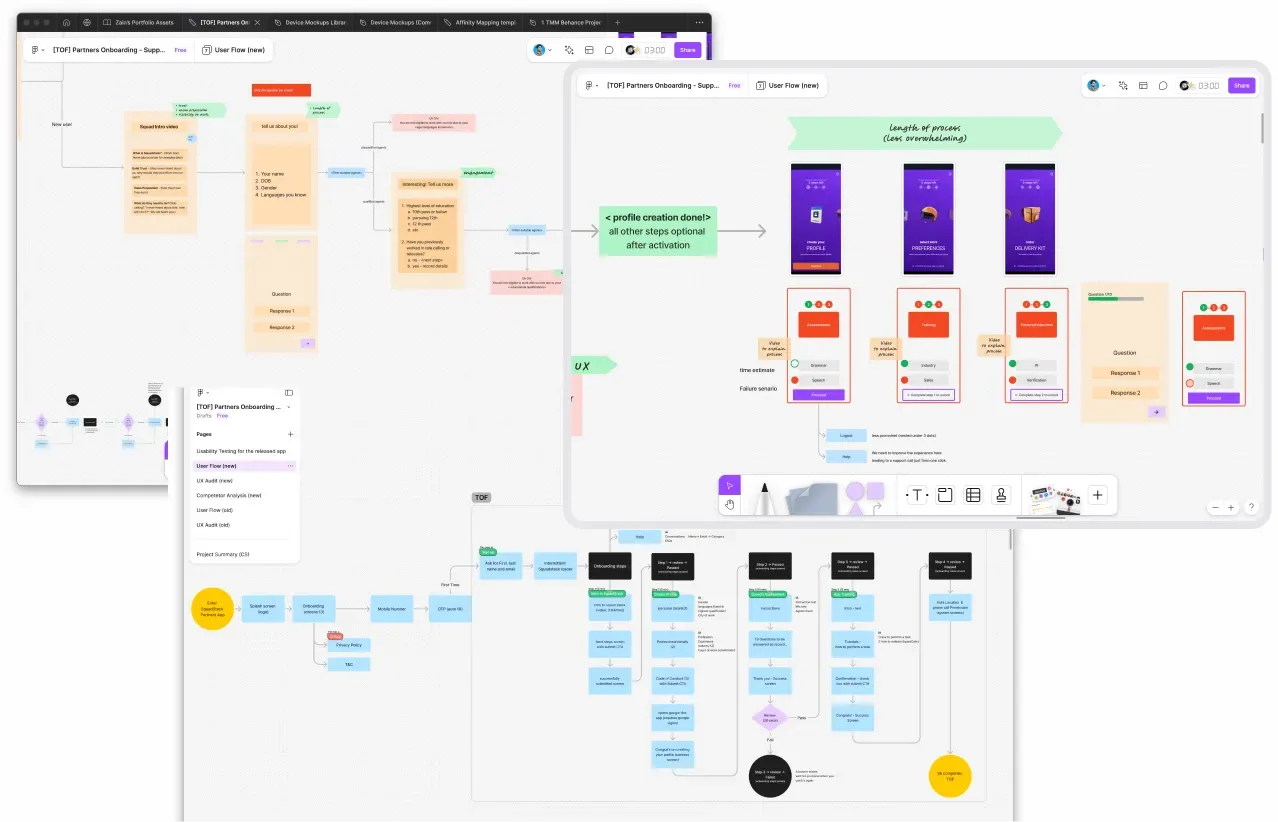
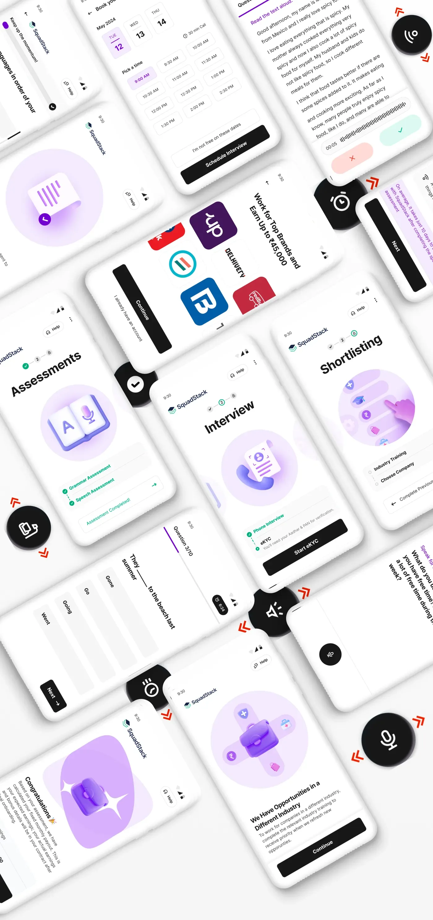
The spine of the new flow: splash → three onboarding screens → a mandatory intro video → phone + OTP → profile → a "hinge screen" timeline hub → assessments → interview + eKYC → industry certification → company selection.
The intro video (borrowed shamelessly from Zomato's playbook, produced with an agency in four days) answers the three questions the research said mattered most: what the work is, what it pays, and how. Onboarding screens show real earners and the brands partners can work with, social proof doing trust's heavy lifting.
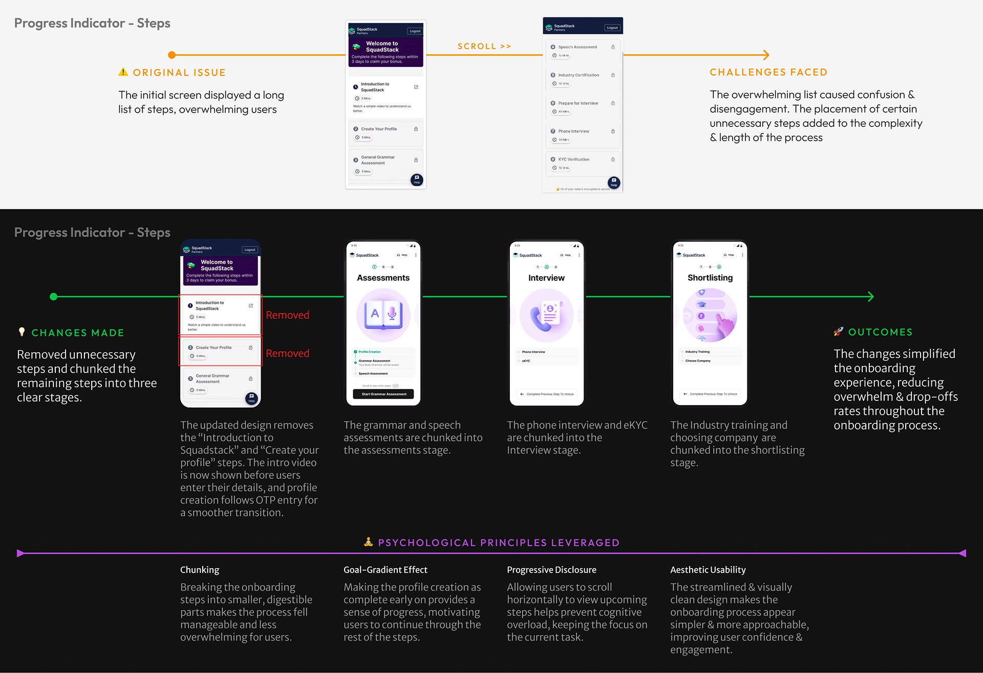
The hardest call: for speech assessment, a third-party model (Pearson's) offered a smoother experience, and would have raised the acquisition cost we existed to cut. We built on the in-house data-science model instead, and I pushed for native app UI over web forms so we kept full control of the experience around it.
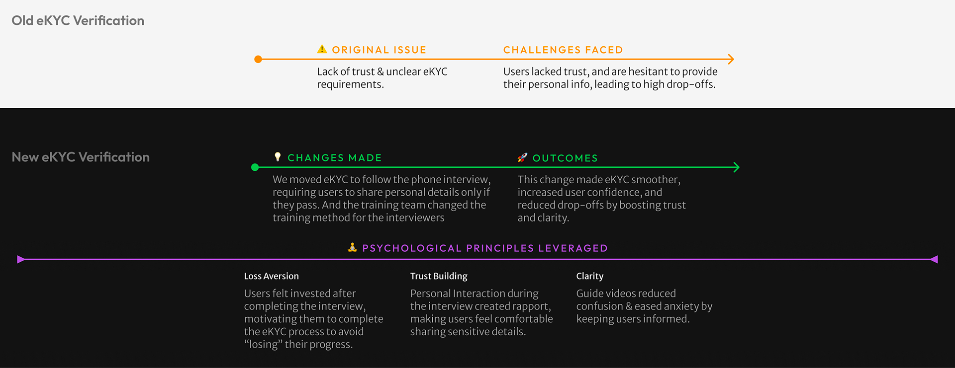
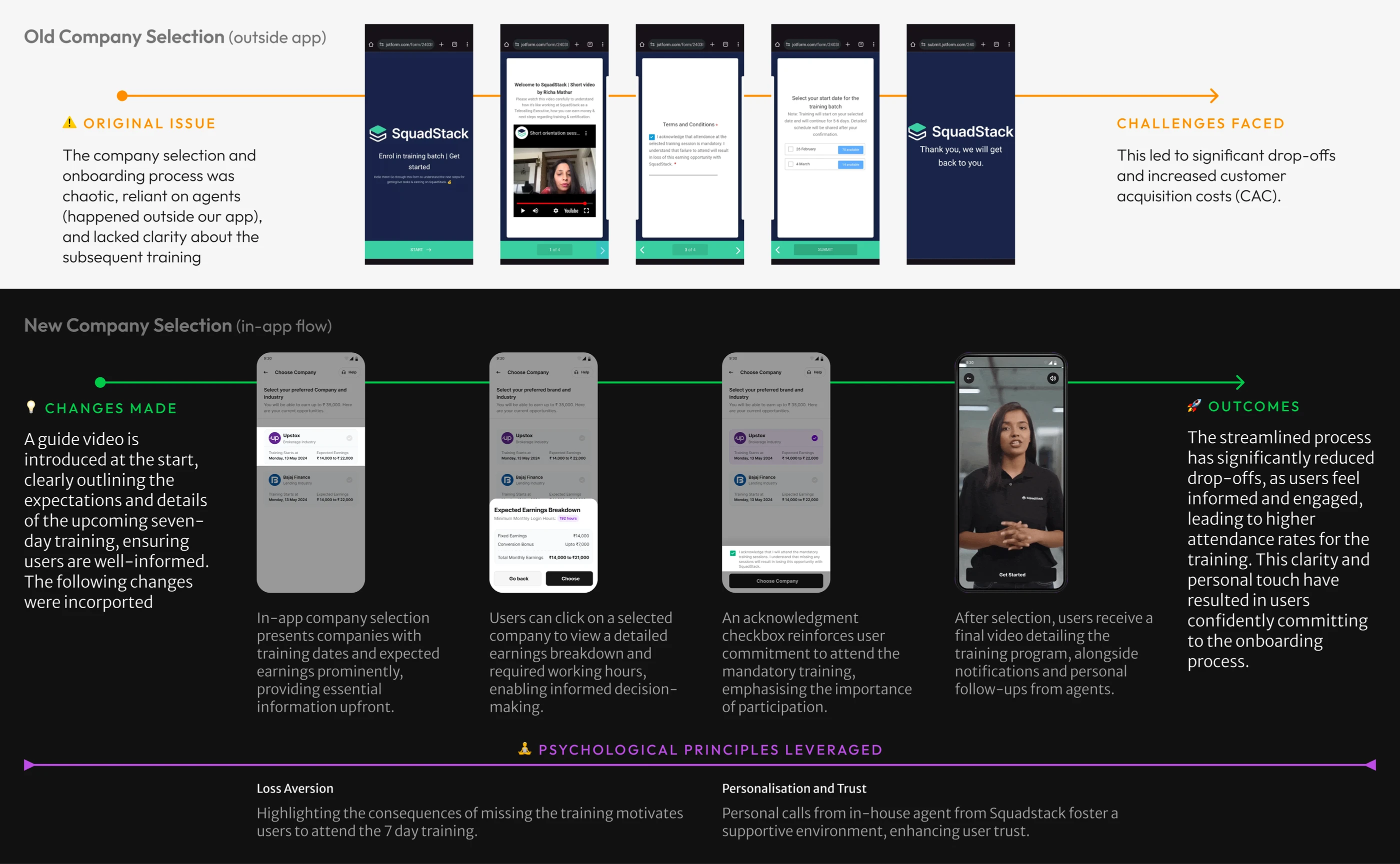
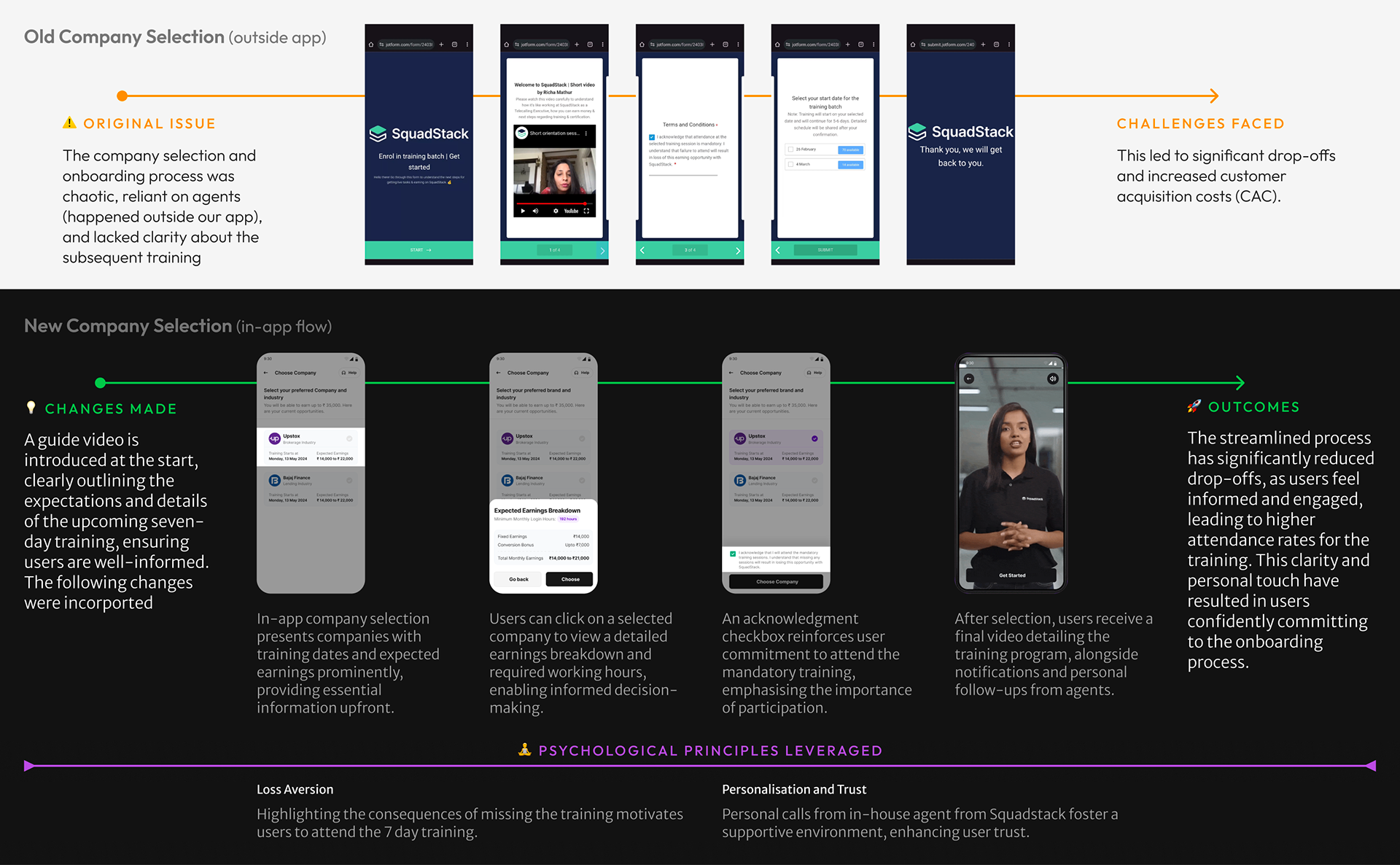
With no time for a pre-launch usability study (design and dev ran in parallel), we shipped to the Play Store inside the three weeks and watched the real world instead. Microsoft Clarity sessions caught the early bugs before most users could report them. The proper usability study ran post-launch, with analyst dashboards standing behind the qualitative KPIs.
Outcomes
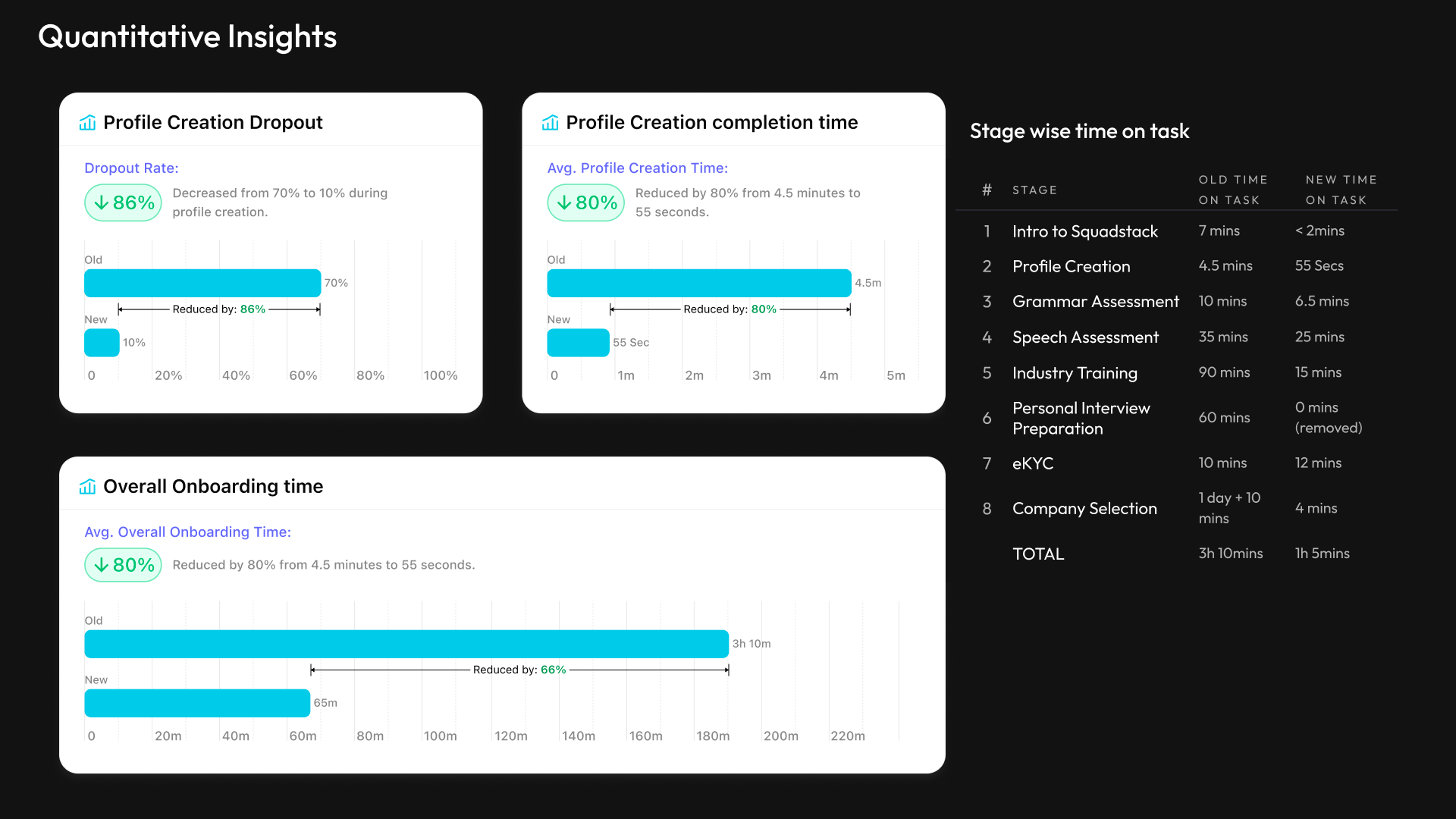
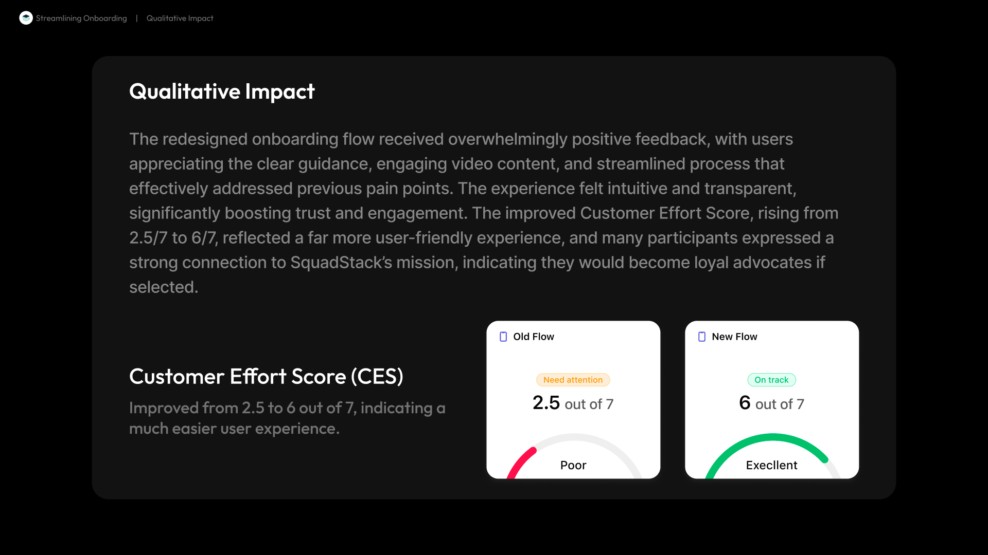
The honest mechanism first: end-to-end conversion held steady, deliberately, because the funnel must keep filtering for talent. What changed is that people stopped needing to be paid to get through it. The ₹850-per-person incentive scaffolding came off, drop-off at the worst step collapsed, and the unit economics flipped:
- CAC: ₹10,000 → ₹2,700 per partner. The ₹850 in incentives coming off was the visible part. The bigger lever was the channel: a direct flow good enough to stand on its own meant supply could come from Contract Partners signing through the app, not from BPO partners taking their margin slice, and that shift is most of the drop.
- Profile-creation drop-off: 70% → 10%. Time on that step: 4.5 minutes → 55 seconds.
- Full onboarding: 1h 15m → under 30 minutes. Customer Effort Score: 3 → 6 out of 7.
- Interview slots booked: 60-70% → 100%.
- Supply fulfilment: 3 days → 4 hours. New business go-live: 3 weeks → 1 week (with a parallel training-team effort halving the training window).
The mission math mattered as much as the margin math: every direct partner is someone in a Tier-2/3 city (homemakers, people who can't relocate) earning properly from home, without a BPO in the middle.
What still wasn't good: the speech assessment scored lowest of any step (CES ~4): too long, too repetitive. The fix we chose was again the cost-honest one: improve the in-house model to ask fewer questions at the same accuracy, rather than buy the problem away and re-inflate CAC.
The team
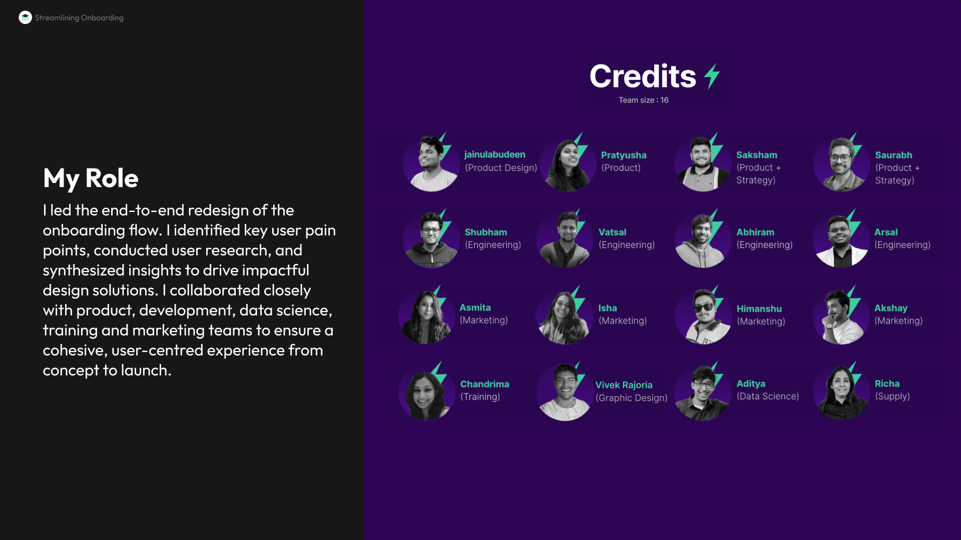
A war-room of sixteen. I owned research and design end-to-end; supply recruited the participant pool; product pulled the quant baselines and co-wrote the interview script; data science built the speech model; marketing and an external agency turned the videos around in four days; illustrations by our visual designer, Vivek.
What I carry forward
Trust is a design material. The redesign didn't convert more people. It removed the cost of distrust: the bonuses, the hand-holding, the drop-offs, the three-day fulfilment lag. And the discipline of "friction only where it assesses" turned out to be the sharpest scoping tool I've used: it told us exactly which parts of the funnel were allowed to be hard.