Draft: Zain's voice pass pending. Adapted from a LinkedIn post; he reviews before this publishes.
DesignUp, Episode 5. Most of our "good design instincts" only work for people who think like us. Khushboo Agrawal opened the gap with two stories: a user in Bihar giving a 1-star rating because she logically read it as "number one, the best." A teen in Delhi reading "scan your Aadhaar" and treating the card like a UPI QR code, because that's his mental model of "scanning."
They didn't lack understanding. We lacked context. It happens because we assume Western conventions are universal. Khushboo calls it the "English-default bubble." Only ~10% of India speaks English; most products still assume English patterns, metaphors, and logic as the default.
I've seen this firsthand at Porter. Standard UX says red means destructive/stop. For a delivery partner on the road, red means urgent: pay attention, act now. When literacy is a barrier and partners can't read English or sometimes their own language fluently, colour isn't aesthetic, it's instruction.
Digging past the surface
Standard empathy maps (see, think, feel, do) are only the surface. Khushboo's four invisible layers underneath:
- Foundational structures. What are they born into? Caste, class, religion, gender.
- Systems & institutions. What do they actually have access to? Infrastructure, devices.
- Family & community. What shapes their daily decisions and norms?
- Aspirations. Who do they look up to; what's their personal definition of success?
Only after those layers do you reach behaviour. Digging this deep is uncomfortable on purpose. It forces the realization that the user isn't confused, our lens is just too narrow for their reality.
Design as power
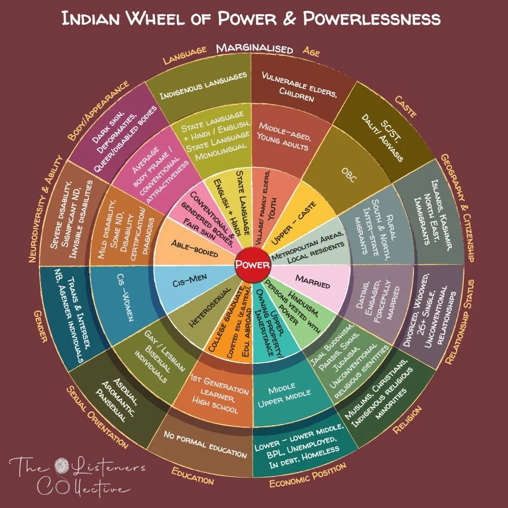
She referenced the Indian Wheel of Power and Powerlessness: if you're urban, English-speaking, tech-fluent, and upper caste, you sit near the center, closer to power. Most users sit at the margins. Her message: use your power to create access, not distance. Meet users where they are.
As designers we have real agency to shift norms and shape behaviour for the better. If we don't lead that, who will?